CSS from the Ground Up
Introduction
If you are frightened by the prospects of using Cascading Style Sheets, there's no need to be. Using a computer can be daunting for someone coming to it afresh but after a while, you think nothing of it. It all comes down to taking small steps to begin with and that's what I'm going to do in this series of tutorials. One step at a time!
Whether you normally use a WYSIWYG editor and stay clear of that source stuff in the background or even if you have never created a Web page at all, this tutorial will set you off in the right direction.
It assumes little or no knowledge of putting a Web page together. It really is 'from the ground up'.
What will you need?
Nothing special. If you have a web page editor, fine. If not, you can use any text editor – Notepad or Notepad++ on a PC or SimpleText or TextEdit on a Mac. If you are already using something like DreamWeaver or Komodo Edit, we are going to be using 'code view'.
Don't panic!
A graphics editor is not essential because I won't be worrying too much about graphics to begin with.
Oh, you will also need a browser, but that goes without saying. In fact, I'd recommend that you get a few different browsers. In the end your website needs to look good in all of them - Internet Explorer, Firefox, Chrome, Safari, etc.
If you want to upload your pages to a Web server, you will need some kind of FTP program but don't worry about that for the minute, you will doing everything here on your own computer.
Step One – A Basic Page
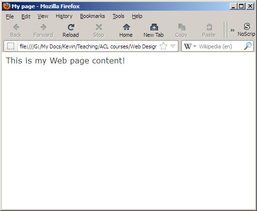
Before we can do anything, we need a basic Web page. Here is the most basic Web page possible.
<html><head></head><body> This is my Web page </body></html>
What we have here are three sets of 'tags' – tags usually come in pairs but not always.
Encompassing the whole page is the <html>...</html> tag pair. The first one <html> is the 'opening tag' and the 'end tag' is the same, except that it has a forward slash character between the < and the html>.
Inside the <html></html> tag are two more tag pairs.
<head>...</head> contains information that doesn't actually appear on your Web page, the most important probably being the page title that appears in your browser's title bar. You do this by enclosing the page title inside a title tag pair like this...
<html>
 	<head>
 		<title>My page</title>
 	</head>
 	<body>
 		This is my Web page content!
 	</body>
 </html>
The <body>...</body> tag pair encloses all the content of your Web page, the text, images, video – whatever. You can type it into your text editor or into the 'source' window of a WYSIWYG editor – or you can copy and paste it from here.
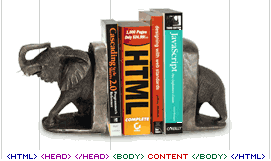
This is my HTMLephant. Yes, it's corny but at least you won't forget it!
So there is a Web page that will work fine in any browser – after you have saved it. Call it 'index.html' because that's the preferred default name for the first web page. You can save the file anywhere on your computer's hard disk, but to keep things neat and tidy, create a new folder to keep your Web pages in.
Your page should look like this:
Wonderful as it is, your Web page is missing a vital ingredient – content. There is little point in having a Web page if it doesn't actually say something (other than "This is my web page content!") but I'm going to leave that up to you.
Any content must go between the <body>...</body> tag pair so that the browser will display it.
Just poured into a naked Web page like this, text has no structure or style. By structure, I mean that the words just flow left to right, top to bottom words with no particular emphasis other than the order in which they appear. It makes more sense to group those words and sentences into paragraphs, headlines, subheadings – well, you know, the basic things you were taught at school.
Browsers ignore any line breaks or paragraphs you have in your raw text. They also ignore tabs and if you have more than one space between words, the extra ones are ignored too.
Almost any passage of text benefits from having a headline, a subhead, a few separate paragraphs and maybe a 'byline' at the bottom.
In HTML, the mechanism for doing this is provided by yet more 'markup' tags.
A paragraph is created by enclosing text within <p>...</p> tag pairs. In HTML, a paragraph is simply a block of one or more sentences with an extra bit of space to separate it from the next one – like the ones you see here.
For headlines, there are six different degrees of emphasis going from the largest <h1>...</h1> down to the smallest <h6>...</h6> They look something like this...
This is a h1 heading
This is a h2 heading
This is a h3 heading
This is a h4 heading
This is a h5 heading
This is a h6 heading
As you can see, they decrease in size as the number gets bigger with h4 being approximately the same size as this 'small' body text. h5 and h6 are smaller, but bold.
There are a few other tricks that we often play with text to give emphasis to words and phrases. Rather than thinking about how they look, consider their true functions.
Bold is a heavier version of the body text and denoted with <b>...</b> however, bold is a print style term and on the Web, it is preferable to use strong <strong>...</strong> Although they will look similar on your screen, HTML should work on other devices too. Software that reads Web pages to people with poor vision will understand strong and add the necessary stress.
Italics are produced with, you guessed it, <i>...</i> tags. Again, with HTML, it is better not to use this visual style but to use <em>...</em> This gives the functionality of italic type regardless of the device reproducing the text.
Underlining can be done with the <u>...</u> tag pair but underlining on a Web page has a special meaning. It usually indicates a link. It is best not to use underlining as a means of emphasis as it will confuse the readers.
The one other important tag is the line break <br /> Unlike the other tags, this one doesn't require an end tag, it wouldn't make much sense anyway, where would it go?
By using these basic markup tags, the text starts to take on some form. It becomes more like what you would produce with a word processor.
This basic page will probably look quite different in other browsers and computers. Every browser has its own default set of styles and unless you instruct the browser differently, it will use these defaults. To over-ride the default styles, we simply produce our own styles which are grouped together into a collective 'style sheet'.
Step 2 – A Style Sheet
A style sheet is a simple enough concept, it's a page of style definitions or specifications that instruct the browser how to display the various elements on a page. If you are wondering where the 'Cascading' comes in, don't worry about it yet. I'll come back to that later when we start to apply styles to our HTML.
For simplicity, we are going to build our style sheet into our Web page. Later, you will find that you can have an 'external style sheet' in a separate file which can be called upon by several pages and has the big advantage that you only have to make one change on this master style sheet to affect all the other pages that link to it.
The styles we are going to use are defined in the <head>...</head> part of our page like this...
<head>
 	<style media="all">
 	<!--
 	-->
 	</style>
 </head>
Here, you see a pair of <style>...</style> tags but there ia another bit in there that need to be explained.
media="all" is where it starts to get interesting. You can have a style sheet to describe how your page looks on a computer screen (media="screen") and another completely different one to format it for printing (media="print"). There are other media too such as 'projection', 'tv', 'braille' and 'aural'. Now you will appreciate the logic of not using 'bold' and 'italic'. For now, we'll just use 'all', which is general purpose.
The <!-- and --> characters are a way of hiding text on a Web page – you can only see it in the markup. This is called 'commenting' but as the styles are in the <head>...</head> section of the page, they shouldn't show up anyway.
The first thing we are going to define the style for the overall body of the page. Everything within the <body>...</body> tags will have this style, or set of styles applied to it.
The basic body style definition looks like this...
body { } The word body followed by a pair of curly braces.
We will give the page a background colour...
Browsers default style usually give black text on a white page, but we will change that to a warm pale grey. This is how we give the body background colour a value. Note that we don't use an equals sign '=' but a colon ':'.
body { background-color: #e8eae8 } What's all this #e8eae8 stuff?
Colours on Web pages are defined by mixing 256 shades of red, green and blue in various proportion. Humans have 10 digits on their hands, so they count in tens. Computers prefer to count in sixteens, not that they have fingers, but once you go over nine, there are no single numerals to represent 10, 11, 12, 13, 14, 15 so we substitute letters a, b, c, d, e , f. So, in 'hexidecimal' counting, 10 is represented by 'a' and 15 by 'f'. When you go above 15, you add a second digit and '10' represents 16. Using this method, all the numbers from 0 to 255 can be represented by two numbers or letters - 255 is ff. So, #ffffff would be white and #000000 black.
Our background colour is therefore red e8(232), green ea(234), blue e8(232). The hash sign at the front denotes that were are using hexideximal and not ordinary decimal numbers.
Sometimes you will see only three characters, for example, #2a0. This is shorthand for #22aa00. When there are two characters the same in each of the three colour values, you can dispense with the second and the browser will understand what is meant.
Using only three digits, you can have 4096 different colours, with six digits there are over sixteen million.
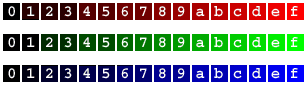
With single digit colours, red, green and blue each have 16 steps of brightness that can be combined in many ways to produce all the others.
If you are hand-coding, using three digits colour values is simpler – and probably enough.
Anyway, let's now add a type colour to take the place of black. It was chosen with a colour picker tool in Photoshop so its a 6 digit hexidecimal number...
body { background-color: #e8eae8; color: #5d665b } Note how the background-color and foreground (type) colour are separated by a semi-colon. Be careful not to mix up the colons and semicolons or things will go horribly wrong.
And now, so that the type doesn't run right up to the edges of our page, we can give the page a margin all round. 'margin: 50px' is added to our body style definition, again separated from the previous one by a semi-colon.
body { background-color: #e8eae8; color: #5d665b; margin: 50px } Any type we now add to the page will be a dark grey/green on a pale grey background by default. We will see how this can be over-ridden for special cases later.
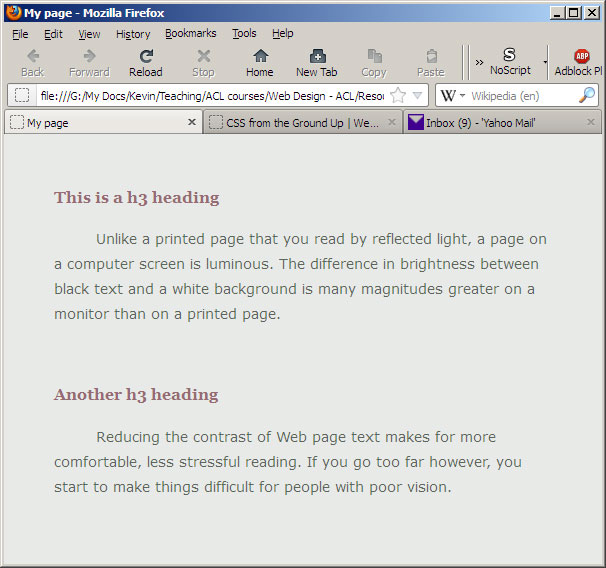
Your page should now look something like this:
Step 3 – Styling Text
Although we have rid our page of the stark black and white look and replaced it with a gentler feel, there's a lot more we can do. We can change the type face, the type size, the amount of space between lines and add other niceties such as paragraph indents.
The font style
We'll do the font style (typeface) first as that makes quite a dramatic difference. Unlike designing for print, Web pages can only use fonts that are installed on the reader's computer so we can't specify just any type we fancy, we have to use ones that are common to all computers – ones that come pre-installed with the system. That narrows the choice down quite considerably. You will find that you are limited to two or three serif faces, the same number of sans-serif faces and a monospaced, (typewriter) style. Instead of choosing only one font style, we specify a range in the hope that one of them will be installed on the reader's computer.
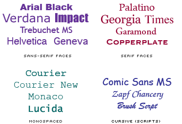 Here are some common fonts on Windows and Mac computers. You can't depend on any particular one being present so you have to provide alternatives.
Here is a typical sans-serif font family specification.
font-family: Verdana, Geneva, Arial, sans-serif; This is a serif font family
font-family: Georgia, "Times New Roman", Times, serif; Note that when a font name has more than one word, the whole thing has to be put inside quotation marks – "Times New Roman"
Let's add the sans-serif fonts to our styles and see what happens.
The font size
Specifying a font size is a contentious issue. In print, you can specify a font size in points and the type will always be that size. It will always take up the same amount of page space and the line breaks will be exactly as you set them.
On the Web, font sizes are not set in stone and change from one computer to another, sometimes quite dramatically. Depending on the user's screen size, operating system and browser, type can go from unreadably small to kiddie's picture book large. Luckily, users are able to set a 'comfortable' size within their browser's preferences which narrows-down the size variations a little, but they can still be quite different from what you expect.
With the rising popularity of Wi-Fi and handheld devices, the browsing conditions for your pages will change dramatically in the next few years. To keep you pages futureproof you need to think in terms of liquid page designs that adapt themselves to the screen size.
Repeat after me, "The Web is not the same as print!"
Units for font sizes
If you want the widest possible audience for your pages, it is best to specify the font size relative to the user's chosen default size. There are various ways of specifying relative font sizes. You can use percentages of the default (%), or use can use a unit called an 'em', which is the same as 100%. 1.2 em is the same as 120%.
In practice modern browsers can also deal with font sizes specified in pixels - eg 16px.
The line spacing
The amount of space between lines is about 120% of the font-size by default. Adding a little extra generally improves legibility, especially if the lines are long. I'll discuss line length later. With our current page, the line length is determined by the width of the browser window, so it might well be longer than ideal.
To change line spacing, again we can opt for relative (% or ems) or absolute (px). In this example, I've set the line height, that's the height of the character plus the extra spacing above it to 180% of the font size (small) for the whole page. As the body style definition is getting a bit long, I've split it into multiple lines, the browser doesn't care but it makes it easier for humans to read. As long as the curly brackets are there and each style definition is separated by a semi-colon, that's fine.
body { background-color: #e8eae8;
 	color: #5d665b;
 	margin: 50px;
 	font-family: Verdana, Geneva, Arial, sans-serif;
 	font-size: 14px;
 	line-height: 180%
 	}
Paragraphs
Everything we've done so far affects all the text on the page. Now we will look at how we can narrow our style down to more specific areas.
As I mentioned earlier, large blocks of text can be broken up into paragraphs to make them easier to read. There are a number of ways to visually separate paragraphs from one another. You can add some extra space or maybe indent the first line.
In creative typography, designers will sometimes use other, less common techniques such as grossly indenting by half a column width or even exdenting (the opposite of indenting). CSS can handle all these but the default paragraph separator is a 'paragraph space' which is about half of the line-height.
To make a block of text into a paragraph, simply enclose it inside a <p>...</p> tag pair. To be able to manipulate the paragraph style with CSS, we add p { } to the style definitions in the page's head under the body styles. Inside the brackets, add text-indent: 3em
<style media="all">
 	<!--
 	body { background-color: #e8eae8;
 		color: #5d665b;
 		margin: 50px;
 		font-family: Verdana, Geneva,
 		Arial, sans-serif;
 		font-size: 14px;
 		line-height: 180%
 		}
 	p { text-indent: 3em
 		}
 	-->
 </style>
Headings
I've already explained about the six levels of headings that you get by default in HTML. We are not stuck with those, we can redefine them to our own requirements. Again it's just a matter of adding more definitions to the styles.
Headings, by default are big and bold and have extra space above and below. Remember, headings from h1, h2 and h3 are bigger than normal text and h5 and h6 are smaller. Let's play with a h3 heading and change its colour and font.
h3 {color: #966b72; font-family: Georgia, "Times New Roman", Times, serif }
Your page should now look something like this:
You may notice that I've added a blank line above the second heading. If you just put an empty paragraph <p></p> it won't work, there has to be something inside the tags. Putting a blank space won't work either <p> </p> because HTML ignores spaces unless they are between characters. What we need is an invisible character and HTML provides one called a non-breaking space which can be typed-in as like so...
<p> </p> The non-breaking space is also very useful to put between words that you don't want to split when the words wrap at the end of lines - things like people's or company names.
Extra tweaks
Before going on to the next part, let's try a few extra tricks with our page of text.
In the body definition, I set the margin to 50 pixels all round. We can have different margins for left, right, top and bottom. All we need to do is split them up like this:-
margin-top: 70px;
 margin-left: 120px;
 margin-right: 50px;
 margin-bottom: 70px;
That gives something more like a printed page with a wider left-hand margin.
Now, you have a page that has a bit of style about it – without too much effort. Nevertheless, it's still like a typewritten or word-processed page. In the next issue, we'll look at some more interesting layout possibilities.
Whilst you are waiting, you can play around with the values in the page you have just created. Try different font styles, sizes, line spacing but most importantly, look at your page in as many browsers as you can to see how different thay can be.
Step 4 – More text formatting
Before going any deeper into text formatting, it's a good idea to familiarise yourself with some basic typographic terms.
When we talk about type size, or font-size in CSS, it refers to the distance from the top of a capital letter such as 'A' to the bottom of a descending letter 'p' or 'y'. There might also be a small amount of extra space called 'leading. The word comes from the fact that printers used to put strips of lead (metal) between lines of type to give more line space.
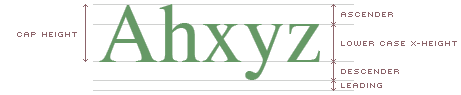
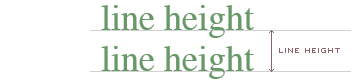
Today, we don't use lead, we just say that there is so much line space between the base of one line of type and the next. Line space is therefore the height of the type plus this extra space. In CSS, we might say line-height: 180%; with the value sepecified as a percentage, ems or pixels (px).
CSS also gives us control over horizontal spacing, the space between individual letters and words.
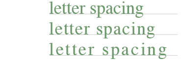
This is useful for adding visual style to headlines.
SPACED HEADLINE
letter-spacing: 0.5em; word-spacing: 0.5em
Designing for readability.
Before CSS there was one vital feature that was missing from HTML text formatting that even the most humble typewriter could handle – line spacing. When there is little or no space between lines of text, it becomes intimidating and difficult to read. The longer the lines become, the worse the problem gets.
Lines that are too
short cause
the eye's left to right
reading pattern
to be disrupted
too much.
Lines that are longer than ideal are also tiring and the beginning of the next line down becomes more difficult to locate.
For comfortable reading, a line of text should be about the same length as one and a half to two lower case alphabets – that means 40 to 60 characters or eight to ten words.
If lines get longer, more line space helps readability. Many early Web pages had text running all the way from the left side of the screen to the right, regardless of the screen size. Some still do – and screens have become wider too.
By default, there is a little line space in browser text settings. It's approximately 20% of the font size (cap height plus descender). With CSS you can have as much line space as you like. If you are using relative font sizes, you can specify it as a percentage of the font-size – font-size: 1em; line-height: 1.5em (the same as 150%). If you are using an absolute font sizes, you can specify something like font-size: 11px; line-height: 16px
Contrast
Unlike a printed page that you read by reflected light, a page on a computer screen is luminous. The difference in brightness between black text and a white background is many magnitudes greater on a monitor than on a printed page.
Vast expanses of black text on a white background can be like walking in bright sunlight without sunglasses. Only in extreme cases would you shade your eyes to look into the distance outside, before that you will probably be squinting and feeling uncomfortable without realising quite why.
Reducing the contrast of Web page text makes for more comfortable, less stressful reading. If you go too far however, you start to make things difficult for people with poor vision.
In an article like this where there's a lot of text to read and the reader is likely to spend some time in front of their screen, it is important to make the experience as comfortable as possible, so I have used a gentle background tint and soft colours.
Step 5 – Lotsa lists
Another very useful formatting technique often used in documents is the 'list'. These are like paragraphs but have a little more going for them.
HTML provides for basic lists that either have bullets (unordered lists) <ul>...</ul> or numerals (ordered lists) <ol>...</ol> at the beginning of each list item <li>...</li> Each type has a few options that can be specified from HTML – <li type="square">...</li> gives a square bullet, <li type="i">...</li> gives lower case Roman numerals.
- Unordered list item
- Unordered list item
- Unordered list item
Default unordered list
- Unordered list item
- Unordered list item
- Unordered list item
Unordered list with square bullets
- Ordered list item 1
- Ordered list item 2
- Ordered list item 3
Default ordered list
- Ordered list item 1
- Ordered list item 2
- Ordered list item 3
Ordered list with roman numerals
CSS gives you more options and control – just add a definition for ol or ul to your styles.
ol {list-style-type: lower-roman; margin: 1em 0 1em 40px } This does the same job as adding it to each list item in HTML and gives you control over the margins around the complete list. The four values 1em 0 1em 40px refer to top, right, bottom, left and can be ems, percentages or pixels.
If you want closer control of the individual list items, you can specify margins for those also – to get more line space, for instance...
ol li { margin: .5em 0 .5em 0 } adds an extra half em of line space above and below each list item for an ordered list. For an unordered list you would substitute ul li.
Even better, you can use your own graphics for bullets.
ul { list-style-image: url(/images/smiley.gif) }
ul li { margin: 1em 0 1em 0}- You are going to like this
- You will love this too
- And what about this
Step 6 – Linking
The whole point about HTML is that HT (HyperText) bit. Links added to words, phrases or images on a page can be clicked upon to whisk you off to some other place. These other places are called 'anchors'. Just think of stationary ships in the great sea of the World Wide Web with a chain made from links going down to an anchor on the sea bed.  The ships are anchored at specific locations and that makes them easier to locate than if they were adrift at sea.
Each page has at least one anchor on it. The default one is right at the top of the page but you can add more anchors to any part of a page that you would like to be able to jump to.
<a href="http://www.wpdfd.com/index.html">This is a link to the top of my home page</a>
So, you have a pair of tags <a>...</a> plus an extra href="..." part included within the first tag. This is the hypertext reference address that you want to go to.
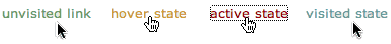
As you are aware, links on a page are indicated by making them visually different from the surrounding text. The default is to underline the link text and make it blue. When you click on a link, it provides visual feedback by changing its colour to red. When you later come back to that link, it has changed colour again, to purple, to show that it has already been visited. Everybody that has ever used a Web page gets the idea of these conventions very quickly.
The default presentation of hypertext links in HTML has three distinct states.
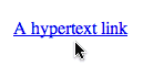 An unvisited link
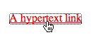 An active (just clicked) link
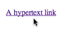 A visited link
Note that the cursor changes too. The default arrow pointer changes to a pointing finger when it passes over a link.
Of course, being 'designers' we are not content with the default look of links. Underlined text may be practical, but it can look ugly. The key requirement is that a link looks sufficiently different from the surrounding text to show that it's something special. Context is an important factor here too. Some text is obviously a 'menu' of choices whether it is underlined or not. Its prominence and position on the page and the fact that the words are inviting you to go somewhere else all give clues to its function.
Similarly, when a word or phrase within a block of text looks different, it must be for a good reason. The reason could be to add emphasis but again, it's the context that gives the clue and also the fact that other similar words or phrases have the same, consistent look. It wouldn't work if every link was a different colour.
CSS allows us to play around with how links look. Links don't have to be underlined, they don't have to be blue. All we have to do is set up a definition for 'a' – anchors.
a:link { color: #696; text-decoration: none }
As this page has a colour scheme other than black and white, I have changed the link colours to ones other than the default blue/purple. text-decoration:none gets rid of the underline.
If you want a visited link to be a different colour, you do this...
a:visited { color: #699; text-decoration: none }
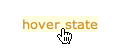
CSS also allows an additional 'state' called 'hover'. This changes the colour of the text as the mouse pointer passes over it and gives a very useful extra clue that it is a hypertext link.
a:hover { color: #c93; text-decoration: underline } There's that traditional underline coming in if you want it, but only temporarily whilst the pointer is hovering over the text.
The 'active' state of a link is what you see when you actually click on a link. Usually, it changes colour and some browsers also put a box around the text too.
To set up link styles that apply to the whole page, you would put something like this inside the style definitions in the head of your page.
 a:link { color: #696; text-decoration: none; }

     a:visited { color: #699; text-decoration: none;  }

      a:hover { color: #c93; text-decoration: underline;  }

      a:active { color: #900; text-decoration: underline;  }
The order of the style definitions is important here. Usually, the order doesn't matter in CSS definitions but here it is important that the a:hover and a:active definitions come last or they might not work.
The other element we have at our disposal here is the background colour behind the text. Sometimes designers change the text background to give an effect like a highlight marker for the hover and/or active states.
There's a lot more that you can do with CSS links, we have only scratched the surface here but it should be enough you get you started.
Step 7 – CSS Boxes
We've already seen that the text on a Web page can be broken up into headlines and paragraphs and that these mechanisms are already catered for in HTML. We have also seen how the default styles can be modified to suit our own tastes by providing them with new style definitions that over-ride the defaults. Now, I'm going to look at how you can make your own style definitions that extend the capabilities of HTML and make more interesting layouts.
The body of a page is the entire visible area but, as I showed in Step 3, we can break that up into smaller divisions that have their own styles. These divisions can be as small as a single character or larger, rectangular chunks of the page. All we have to do, is surround the area we want to style with a pair of tags <div>...</div> Those divisions are each like a mini page and are often referred to as CSS boxes. CSS Boxes are the fundamental building blocks for building Web page layouts and I'm going to spend some time explaining how they work because it is so important.
CSS boxes can have a width and height, a background colour or even a background image which can be made to repeat to give a pattern. By default, a CSS box goes from the left margin to the right margin of the page body. If you haven't specified a body margin, it will be the full width of the browser window. If you don't specify a height for a CSS box, it will have none. If you put some text into it, it will expand vertically to accommodate that text – or image.
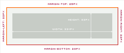
To keep text away from the edge of a box, you can add padding...
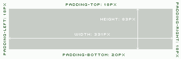
You have to be very careful with padding because it works quite differently in Microsoft Internet Explorer from all other browsers. Unlike the diagram here, IE puts the padding inside the box, so its width and height stay the same. All other browsers put the padding outside the box, adding to its width and height. So your box size will change depending on which browser is viewing your page and this can have quite disasterous results if you are depending on precise pixel measurements.
Beyond the padding, you can have a border...
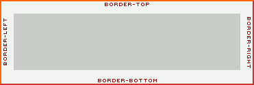
Borders come in a variety of styles and you can address each of the four sides separately in terms of thickness, style and colour. They look slightly different in the various browsers but here is what they look like in Mozilla...
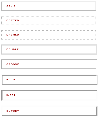
The thickness of your border increases the box size accordingly.
To separate boxes from one another, you can give them margins.
Relative positioning
Relative positioning assumes that CSS boxes are next to another one. The first box is the top one, the next one is below it and the next, below that. They effectively float downwards from the top of the page. This is something that rarely happens in real life but can you image being in a covered-over swimming pool with a pile of air mattresses. One would float to the top, the next would float up and get stuck beneath the one above it – and so on.
To get CSS boxes to sit beside one another rather than one below the other, you have to tell them to float: left; or float: right; Like the air mattresses in a wide swimming pool, they will sit side by side, where there is enough space. Then they will wrap around onto a lower level. You have to try and avoid that situation by making sure that the total widths of all your boxes in a line are not more than the page width. You can do this by specifying the width in pixels – but keeping the total below the minimum width of a browser. Or you can use percentages – making sure that the total percentages add-up to 100 – or preferably, slightly less. With relative positioning like this, avoid mixing pixels and percentages or results will be unpredictable.
Step 8 – Custom Divs
IDs
When you are creating CSS boxes with custom definitions, there are no existing HTML elements to attach them to. You have to invent your own.
As there will probably be several or even many CSS boxes on any page, they have to be given names. We do that by giving them an 'identity' – id for short. An id uniquely identifies a CSS box on your page both to you and the browser so that it knows how to display it.
A simple example is where you divide a page into three horizontal areas. A 'header' at the top carries a logo and the navigational links. The middle bit contains the text and pictures. Down at the bottom, you might also have a 'footer' that gives a copyright notice and, maybe, echoes the navigation from the top.
The example shown below actually has five horizontal boxes, the extra ones are for the navigation bar and the logo and sit between the header and text area.
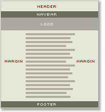
Note that the right columm is narrower than the one on the left to compensate visually for the extra space created by the ragged right hand side of the text – otherwsie the text would look off-centred.
In the style definitions, we stick a hash sign # in front of the name we want to give the box making them into 'identities'.
#header {...}
 #navbar {...}
 #logo {...}
 #midsection {...}
 #footer {...}
Then we have to tie the definitions to the actual CSS boxes by just referring to their ids like this...
<div id="header">...</div>
 <div id="navbar">...</div>
 <div id="logo">...</div>
 <div id="midsection">...</div>
 <div id="footer">...</div>
If we have already specified the type in the body declaration, then our boxes will 'inherit' those styles. Any style definitions that you add to the boxes' definitions will take precedence over the more general body definition. This is what 'cascading' is all about.
Classes
Sometimes you will want to use the same box several times on a page. Suppose you wanted to break-up the midsection into two or more separate boxes. In this instance we need a 'reusable' box instead of a unique one. A reusable box is called a class. Just as you have 'classes' of flowers or insects, a class is basically the same box but with different content. To show that we want a reusable class instead of a unique id, we use a period . instead of the hash sign.
.midsection {} can now be used as many times as we like and on the div itself, we put ...
<div class="midsection">...</div>
 <div class="midsection">...</div>
 <div class="midsection">...</div>
Span
CSS classes can be applied at a text level. If we just want to pick out a few words in red, we can create a special class, let's call it .redtext, like this:
.redtext { #c00 }
and apply it to the text we want to pick out using the span tag like this:
<span class="redtext">This is red text!</span>
This is referred to as inline as it applies to a span of text that is inside another tag.
Use <span>...</span> any time you want to make a variation to some text that differs from the overall specification. It could be colour, font-family, size, weight or whatever.
So, in CSS, there are block elements which are rectangular boxes that can be unique 'ids' or reusable 'classes'. We also have inline elements that can address text at a character level.
Now we are starting to get somewhere!
Step 9 – Getting it right
Doctypes and validation
We are up to lesson nine of CSS from the Ground Up and I have a confession to make. Everything I have shown you so far - the markup, the example pages are all wrong! Well, they will probably work just fine unless you are using an ancient browser but if you test them with a syntax checker or put them through some sort of validation program, they will not pass.
What is a validation program you might ask?
You will be familiar with the concept of a spelling checker. There's probably one in your word processing program. It compares the words you have typed-in to a list of words in its built-in dictionary and alerts you if it can't find a match. It might be that the word isn't in its dictionary but it's also possible that you have misspelled it. In the more sophisticated word processors, your writing can also be checked for proper use of grammar and if you type a sentence that doesn't have a verb in it or too much repetition of the word 'and', it will nag you incessantly.
Before a spelling or grammar checker can do its job, it needs to know what language you are using. My UK English spelling checker is quite different from a US English spell checker - and what if you aren't using English at all?
Just as your English, or whatever language you write in, is checked for correctness, your HTML and CSS can, and should, be checked too. If you make a mistake in your English, people will probably recognise it as a typo, but understand what you mean, there's no real damage done. A tiny slip-up in HTML or CSS, on the other hand, is a different story. Something as seemingly insignificant as a comma or quotation mark out of place, can make all the difference between a page working or not - it depends on the particular error and the browser that's trying to make sense of it. It is a good idea to 'spell check' your HTML and CSS with a 'syntax checker' or 'validator'.
To check your HTML and CSS you can use the online validators provided by the W3C – W3C HTML Validator – W3C CSS Validator – where you simply upload your files and get an immediate report back with a blow-by-blow list of errors – or not!
Of course, the checking program has to first know which 'language' you are using for your markup – there are several 'flavours' of HTML, including HTML4 and XHTML. The latest version is HTML5, which is the best to use for a modern website. Let's use it.
To tell the browser that you are using HTML5 put a DocType declaration right at the top of the page - above the first <html> tag. It looks like this...
<!DOCTYPE html>
Having added a DocType, I can check the page with the online validators provided by the W3C – W3C HTML Validator and W3C CSS Validator – and be confident that they are squeaky clean. With that little side issue out of the way, we can go back to 'styling'.
Step 10 – External Style Sheets
So far, all the styles I've used have been built into a stylesheet within the <head> of the page. That way, it is easy to look at the source code of the page and see what's going on. It's all together in one place. However, it's very seldom that individual pages are done in isolation, it's much more likely that there will be a collection of pages with a common look in a Web site.
Instead of putting the style declarations on each and every page of a site, it's a much better idea to have just one style sheet and get all the individual pages to refer to that. It also means that if you want to change the background colour of every page on your site, or to use a different font face or size, you only have to change the 'master' style sheet. In fact, you can totally change the look of an entire site by making a few alterations to just one file.
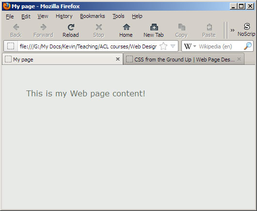
Have a look at http://www.csszengarden.com/ to see this principle in action. Various designers have provided their own style sheets for the same basic page content and demonstrate admirably how the same skeleton can be given different 'skins' that completely change the character. To use an external style sheet, all we have to do is provide a link in the <head> of the page like this:
<link rel="stylesheet" href="basicsstyles.css" media="all">
This tells the browser to look for the style specifications in a file called 'basicsstyles.css'.